New Stuff at Wordnik!

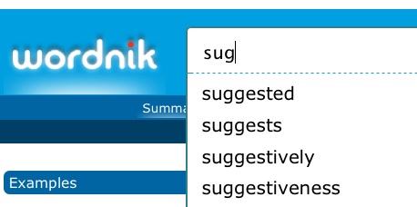
Over the last few days we’ve added a couple new things to Wordnik that we hope you’ll like — first, autocomplete! (Quite a few people have requested this.) Now, when you start typing in the search box, you’ll see a list of suggestions.


What would you suggest?


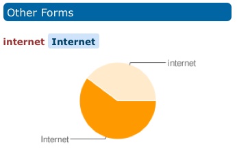
We’ve also added a “forms” graph. What’s a forms graph? A forms graph tells you stuff like this:


is it Internet or internet?
In our data, upper-case “Internet” is still slightly more common than lower-case “internet”.


We’ve also started showing you words used in the same contexts as the word you’ve looked up. These are the words that we’ve found to be used in the same contexts as the word wry:


Those who are wry are also ... ?
These are words that aren’t necessarily synonymous, but words that are used in the same way in the same kinds of sentences. Have a word on the tip of your tongue? Check out our same-context list for a word that describes the same kind of thing as the word you can’t think of. Something that is described as wry (like a sense of humor or a comment) might very well also be called sardonic.


At Wordnik, our plan is to give you as much information as we can about as many words as we can — please let us know how useful you find it!

Carbonated Frequencies

One of the most common questions about our site, on Twitter and in emails to feedback@wordnik.com, is “What exactly is the Statistics bubble chart saying?” Like everything else on our beta site, this chart is very much a work in progress. But it is grounded in real counts of word occurrences, so here’s the full explanation.


The legend reads “Bubble size: how much this word was used in a year. Bubble height: unusualness in that year”. “Unusualness” is hopelessly vague, but the vagueness there — and the absence of any numbering on the vertical axis — was meant to avoid misleading false precision.


The size of the bubble is a representation of the count of occurrences within the given year. The count comes from our collection of text, currently around 4 billion words of running text from Project Gutenberg, web feeds from Spinn3r, and a human-directed crawl of interesting texts from all around the web. Since we have widely varying amounts of text for many years &emdash; and lower (but growing!) amounts for the public-domain black hole of years between 1923 and the rise of the Internet &emdash; the raw count of a word’s occurrence is not very useful for showing how often it was used in a given year. Plenty of words will show up millions of times in the 21st century, because we’ll always have an endless flow of new text from now on. But that would mean that in any year before 2008 or so, everything would always have pitifully low frequency. So instead of showing the count of the occurrences of the word, we divide that count by the total number of word tokens used in that year, and the words that have bigger bubbles are the words that constitute a higher proportion of the words used in the year that that bubble represents. The formula is just:


yay, equations


The height/unusualness is an attempt to highlight years where the word was used more often than the word is normally used in other years. Some have inferred that a word’s unusualness should be the inverse of its frequency: that a rare word in 1960 would have high unusualness. What we’re trying to show is the years where the word is used unusually often, compared to how often the word is used in other years. So while the bubble size reflects the amount that the word was used in that year, the bubble height considers all of the word’s uses in all years, and reflects the proportion of those uses that occurred within the given year.


For example: a word like the should be pretty evenly un-unusual, with lots of fairly big bubbles (since “the” is pretty much always the most frequent word in a given year) hanging out around the baseline (since it’s very frequent in every year). Instead, at the moment, “the” gives you this:
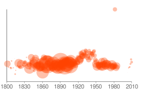

the chart for the word the


with most of the years about a quarter of the way above the baseline. This is a flaw in the way we’re generating our charts via Google: the vertical axis is not constant from chart to chart, so the charts are not comparable, and “the” is spreading a very small amount of frequency variation across the whole vertical space. The next iteration of these charts will have a constant vertical axis, to make them more usefully comparable from word to word, but we’re still looking for the right answer to what the constant axis should be. The current formula for this is:


yay, equations


For our bubble-size number, many people use measures like “count per 10,000 words”, which might be a better way, since the axis is pre-defined. We will need to give it some sort of logarithmic smoothing so that the bubbles for low frequency words don’t completely disappear. A word that occurs only once in a billion words will only occur 0.000001 times per 10,000 words — but we’d still like you to know, right away, that it was used that one time.


If you have suggestions for more useful metrics, and more useful visualizations, bring ’em on!
Beware the Econorrhea

Trevor Butterworth is the editor of the absolutely fantastic STATS.org blog, which has been my favorite media watchdog publication for the past few years. They post authoritatively on topics like media coverage of health issues and the use and abuse of statistics, and happily their quantitative bent is accompanied by a joy in language, particularly of the so-bad-it’s-good variety.

Last month Trevor posted a Wordie list, subtitled Econorrhea, of neologisms and portmanteaux having to do with the economic implosion, which he has now worked into a Jabberwocky parody* on Recessionwire—which is itself compiling the beginnings of what could be something fun: a recession lexicon. It’s all worth checking out, in particular STATS.

* Check the comments too: he’s being pursued by the Lewis Caroll Society.

Dinosaurology

Dinosaurs! They’re teh alesome, as any 8 or 38 year-old will tell you. In an ongoing effort to highlight brilliant Wordie content*, I present chained_bear‘s completely over-the-top collection of dinosaur and dinosaur-related lists:

Dinosaurs
Not a Dinosaur
Words of Dinosaurology
Archosaurs
Pterosaurs, Ichthyosaurs, Plesiosaurs, and a Coupla Placodonts ‘R’ Us
Prehistoric and Extinct Mammals ‘n’ Stuff
Living Fossils
Prehistoric and Extinct Birds
Dinosaurs that weren’t, but should have been

These comprehensive lists are well-tagged, so they can be sliced and diced by, among other things, geologic age:

Jurassic
Paleozoic
Pleistocene

and Linnaean classification:

Therapsid
Sauropsid
Plesiosaur

Some related lists you might also enjoy, if you’re in a Jurassic mood:

Geological time scale, by mollusque
Dinosaur Comics, by AbraxasZugzwang

Plus there’s the fearsome tyrannosaurus reesetee. And last but not least, there’s our pal pterodactyl.

Kudos and thanks to chained_bear, this is a prodigious effort and well worth exploring. At least one of these is an open list, so if any budding dinosaurologists* want to contribute, or flesh out info on the dinosaurs and not-dinosaurs in the comments, have at.

Oh, and be advised: it pays to turn on image search when browsing dinosaur lists.

* Such posts will henceforth be tagged ‘teh alsome’ for your convenience.
** Or paleontologists, if you stand on formality.

Private Notes on Words

A new feature launched this weekend: private notes on words. On any word page, where it says “Leave a comment, citation, or private note”, click on “private note” to leave a postit-style note for yourself.

This is kind of like writing in the margins of a book–if there’s something you’d like to remember about a word, or you want to leave yourself pronunciation tips or study notes or a comment-in-progress or whatever, and it doesn’t seem appropriate to make it public, write yourself a note.

I’m hoping students in particular find this useful, and also people using Wordie to create glossaries or dictionaries. I’ve corresponded with a few folks who have expressed an interest in such a use, and the combination of tags, private notes, and comments seems like a good emerging toolkit. One could use tags to aggregate the words in question (there are already a bunch of good de facto glossaries on Wordie as a result of tagging, like demon, archery and beer), then private notes while collecting definitions or usage notes, with the final result ending up as a citation in the comments.

Or, use it however you want. Any suggestions for improvements or additions are, as always, welcome.

Most Active Threads

Not that I don’t love lists like this, but we’ve all long wanted more ways to sort through and view the river of comments on the front page. So I just added a page listing the most active threads of the past 24 hours, as dreamed up by Prolagus a few weeks ago.

They’re listed in order of the number of comments on the item (words, lists, and profiles), and show excerpts of the three most recent comments.

This needs some work–I’d like to add different ways to sort, make it look nicer, and include comments on tags, which I forgot. But better half baked than nothing, and this way you guys can tell me where it should go.

Though before I revisit this, I’ll add a most commented on list to the front page, which is a fantastic idea (thanks pterodactyl!).

I just added this same post on comments, in case people would rather discuss refinements to this in situ.

Tag All Words in a List

Per the request of Skipvia and others, you can now tag all words in a list in one fell swoop. Click on the ‘add tags’ link on any list page, on the left below the list name.

This tags every word in the list, not the list itself.

If you want to tag every word in a list except for a few, you can bulk-tag the list, then go in to the individual words and remove the tag where not appropriate. So you can tag 498 of the words in a 500 word list in 3 steps, rather than 498.

This is the heart of Wordie: helping you waste time more efficiently.