We’re happy to announce today a new look for the (millions and millions of) Wordnik word pages:
The new pages are cleaner, easier to navigate and read, more colorful, and have been shown in controlled, double-blind experiments to increase the love of words, writing and speaking skills, and vocabulary retention by up to 115% in test subjects*.
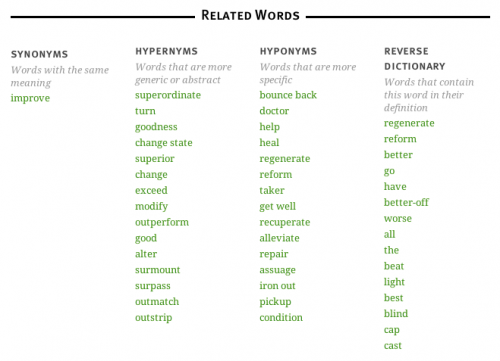
New features include an expanded Related Word (thesaurus) section, with a new “Reverse Dictionary” section:
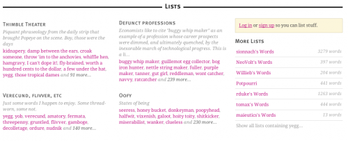
Word pages now include list previews, so you can easily see information about the lists that include the word you’ve looked up:
We’ll be rolling out more improvements and more new features across all of Wordnik.com over the next few weeks. As always, you can send us your thoughts via feedback@wordnik.com or by leaving a comment here.
[*test subjects may or may not have been Wordnik employees and their families.]


Wow!
The old pages were already better than your competitors….
These new pages are beautiful.
It’s obvious that you guys are really thinking about why and how people use dictionaries.
Great job.
Yes, the new look is nice, but where have all the examples gone? The extensive list of words used in context was the only thing setting wordnik apart from other sites. Will the old examples be restored in the following weeks?
Thanks Erik! The extended-examples option will be back Real Soon Now, we promise.
I concur with Erik. The prodigious sentence examples helped to fully integrate many new words to my vocabulary and truly did set wordnik.com apart from competitors. Thank you for bringing back extended-examples as they have been of tremendous help! Many thanks to all the people at wordnik.com for a great website!