Wordnik’s Word Pages: now with 86.5% more resplendence

We’re happy to announce today a new look for the (millions and millions of) Wordnik word pages:

The new pages are cleaner, easier to navigate and read, more colorful, and have been shown in controlled, double-blind experiments to increase the love of words, writing and speaking skills, and vocabulary retention by up to 115% in test subjects*.

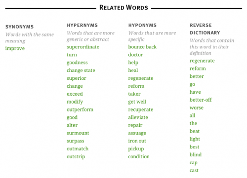
New features include an expanded Related Word (thesaurus) section, with a new “Reverse Dictionary” section:

screenshot of related words at "better"

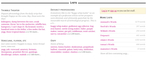
Word pages now include list previews, so you can easily see information about the lists that include the word you’ve looked up:

We’ll be rolling out more improvements and more new features across all of Wordnik.com over the next few weeks. As always, you can send us your thoughts via feedback@wordnik.com or by leaving a comment here.

[*test subjects may or may not have been Wordnik employees and their families.]

Word frequency charts

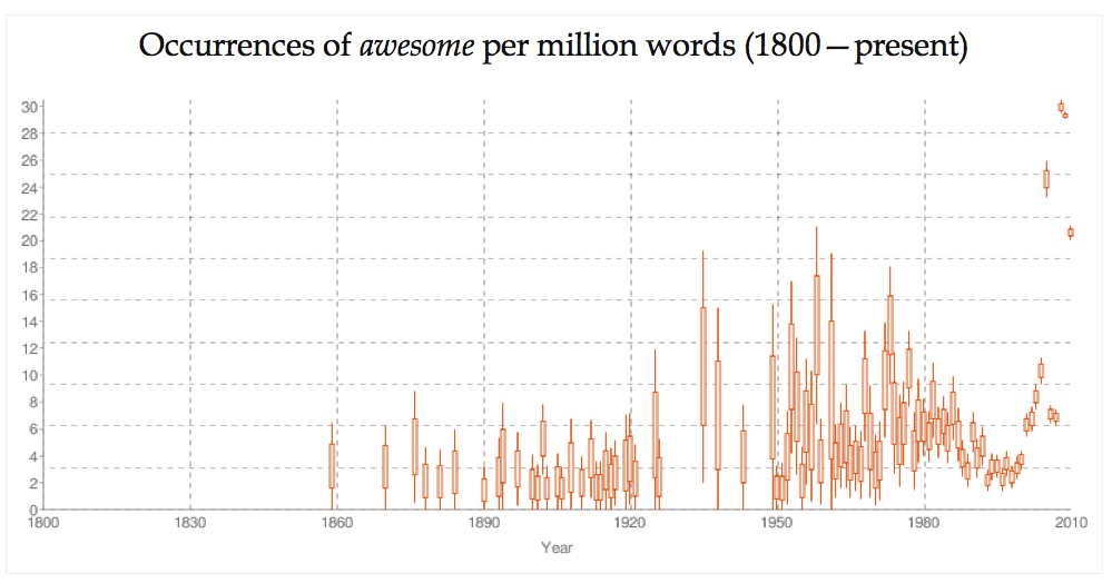
awesome!

This spring, our word statistics pages have quietly improved. We’re now indicating the frequency of a word and how it has changed over the last 200 years. Our new graphs show word occurrences for each year in counts per-million-words-of-text, which — for most words — will be in the low handful.

It’s neat to look at how some words have appeared over time (Internet, a fad which will never catch on) or disappeared (e.g. hansom a two-wheeled horse-drawn carriage). Also neat to see are words that have changed their sense — icon has a new meaning in the late 21st century, and this remarkably changes its frequency (from 1-3 per million up to 10+ in the last fifteen years). (We note that not all statistics are entirely safe for work.)

Since our corpus varies in its density (we have far more text available for the last twenty years than we do in the 150 before that), our frequency representations are shown with confidence intervals, indicating a 95% confidence interval* on a given year. (Sometimes that gives us unusually spiky plots, because the sparse years offer relatively little information.)

In future releases, we’d like to compare two words on the same plot (compare apple to Apple) or explore other aspects of the words’ appearance.

What would you like to see?

* Our confidence intervals use the Agresti-Coull approximation, which is probably too generous in its upper-bound, especially for rare words. We’d like to fix that to include Bayesian priors on word frequencies in a future release.

See also previous post on word-frequency visualization.