One of the most common questions about our site, on Twitter and in emails to feedback@wordnik.com, is “What exactly is the Statistics bubble chart saying?” Like everything else on our beta site, this chart is very much a work in progress. But it is grounded in real counts of word occurrences, so here’s the full explanation.
The legend reads “Bubble size: how much this word was used in a year. Bubble height: unusualness in that year”. “Unusualness” is hopelessly vague, but the vagueness there — and the absence of any numbering on the vertical axis — was meant to avoid misleading false precision.
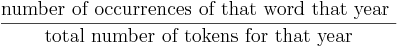
The size of the bubble is a representation of the count of occurrences within the given year. The count comes from our collection of text, currently around 4 billion words of running text from Project Gutenberg, web feeds from Spinn3r, and a human-directed crawl of interesting texts from all around the web. Since we have widely varying amounts of text for many years &emdash; and lower (but growing!) amounts for the public-domain black hole of years between 1923 and the rise of the Internet &emdash; the raw count of a word’s occurrence is not very useful for showing how often it was used in a given year. Plenty of words will show up millions of times in the 21st century, because we’ll always have an endless flow of new text from now on. But that would mean that in any year before 2008 or so, everything would always have pitifully low frequency. So instead of showing the count of the occurrences of the word, we divide that count by the total number of word tokens used in that year, and the words that have bigger bubbles are the words that constitute a higher proportion of the words used in the year that that bubble represents. The formula is just:
The height/unusualness is an attempt to highlight years where the word was used more often than the word is normally used in other years. Some have inferred that a word’s unusualness should be the inverse of its frequency: that a rare word in 1960 would have high unusualness. What we’re trying to show is the years where the word is used unusually often, compared to how often the word is used in other years. So while the bubble size reflects the amount that the word was used in that year, the bubble height considers all of the word’s uses in all years, and reflects the proportion of those uses that occurred within the given year.
For example: a word like the should be pretty evenly un-unusual, with lots of fairly big bubbles (since “the” is pretty much always the most frequent word in a given year) hanging out around the baseline (since it’s very frequent in every year). Instead, at the moment, “the” gives you this:
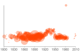
with most of the years about a quarter of the way above the baseline. This is a flaw in the way we’re generating our charts via Google: the vertical axis is not constant from chart to chart, so the charts are not comparable, and “the” is spreading a very small amount of frequency variation across the whole vertical space. The next iteration of these charts will have a constant vertical axis, to make them more usefully comparable from word to word, but we’re still looking for the right answer to what the constant axis should be. The current formula for this is:
![]()
For our bubble-size number, many people use measures like “count per 10,000 words”, which might be a better way, since the axis is pre-defined. We will need to give it some sort of logarithmic smoothing so that the bubbles for low frequency words don’t completely disappear. A word that occurs only once in a billion words will only occur 0.000001 times per 10,000 words — but we’d still like you to know, right away, that it was used that one time.
If you have suggestions for more useful metrics, and more useful visualizations, bring ’em on!
Couple Comments. (1) Project Gutenberg texts are notoriously lacking in provenance descriptions, esp. years. How are you using them to gauge the years? (2) Perhaps the Library of Congress catalog could supply some info on vocabulary by year by using their book titles and whatever else is available from their entries. It would have the advantage of being comparable per year (albeit with a growing volume (assuming) more and more books were published each year). (3) There is the American Heritage Word Frequency List, which ought to be usable in the 20th century for at least a snapshot of frequencies (as well as the other published word frequency counts, Brown-Kucera, Thorndike-Lorge, West’s). Admittedly the problem of compounds not being reported as whole expressions hurts (i.e., ‘New’ ‘York’ ‘City’ as three words hurts). Since these were all dated snapshots it at least provides some input.
Why do most words (except very common ones) have no bubbles at all between circa 1930 and 2005? Is that the gap between out-of-copyright books and the web as a source?
Yep — we’re working with our partners to fill that copyright gap, but it’s taking a little while. We hope to have good data in place soon!
Why can’t I see any of this graphs in the words?
Hi Doron, this post is from quite a while back (2009) — we weren’t able to get the kind of data we wanted to update the graph, so we removed them.