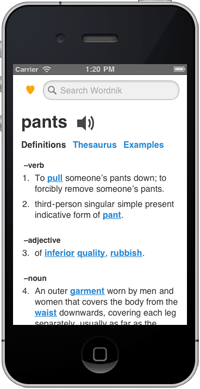
 When you visit Wordnik.com on a smartphone you now get a mobile-optimized version of the site, featuring definitions, examples, related words, and, new in this version, audio. The mobile site, http://m.wordnik.com, delivers the most commonly-sought information on Wordnik.com in a mobile-optimized design that’s easier and faster to use (and which iPhone users can easily add to their home screen). If you want more in-depth information you can click through to the full-sized (immobile?) site, and if you want to always get the larger site, you can opt out of the mobile version altogether.
Mobile traffic to Wordnik is growing—over twenty percent of visitors are using tablets or smartphones—and we strive to be the best source of language information, however and wherever you need it. Please let us know what we can do to keep making the mobile experience better.
Will it be possible for wordnik to integrate with instapaper? Instapaper currently integrates with several dictionary apps, but I like wordnik better.
Hi Rebeca, we’d love to be integrated with Instapaper (we’re fans). But that’s a question for Marco. 🙂